Newsletter subscribe!
Enter your email to unlock an exclusive 10% discount on professional website development tailored to your business needs.

Determining exactly when it is time for a website redesign is one of the most critical financial decisions a business owner can make.
Imagine for a moment that you own a physical retail store in the busiest district of your city. Now, imagine that store has flickering fluorescent lights, inventory from five years ago gathering dust in the window display, and a front door that jams every time a customer tries to enter.
Would you keep that store open in that condition? Of course not. You would renovate immediately. You would fix the lights, update the display, and repair the door because you know that every single day it looks like that, you are actively losing sales to the competitor across the street whose shop is bright, modern, and inviting.
In the digital world, your website is that storefront.
For many business owners, a website is viewed as a “set it and forget it” asset—something they built a few years ago, checked off the list, and haven’t looked at critically since. However, the digital landscape is not static; it is a rapidly evolving ecosystem. User expectations change, Google’s algorithms shift, and design trends that looked cutting-edge five years ago now look obsolete.
If your website isn’t actively helping you grow, it is likely holding you back. It’s not just failing to make money; it could be actively costing you revenue in lost leads, damaged credibility, and wasted marketing spend.
But how do you distinguish between a site that just needs a few tweaks and one that requires a complete overhaul? Here is a comprehensive guide to the five undeniable signs that it is time for a website redesign.
Before we dive into the specific signs, it is important to understand the concept of “Opportunity Cost” in web design.
Many businesses hesitate to redesign their website because of the upfront investment. They look at their current site and think, “It’s still online, it still lists our phone number, so it’s good enough.”
This mindset is dangerous. Your website is often the very first touchpoint a potential customer has with your brand. It is your 24/7 salesperson, your brand ambassador, and your customer service rep all rolled into one. If that first impression is mediocre, the customer doesn’t call you to complain; they simply leave. They hit the “back” button and go to a competitor.
You never see that lost sale. You never hear that feedback. It is invisible revenue loss. A strategic redesign isn’t just about aesthetics; it is about stopping that leak and turning your digital presence into a profit center.
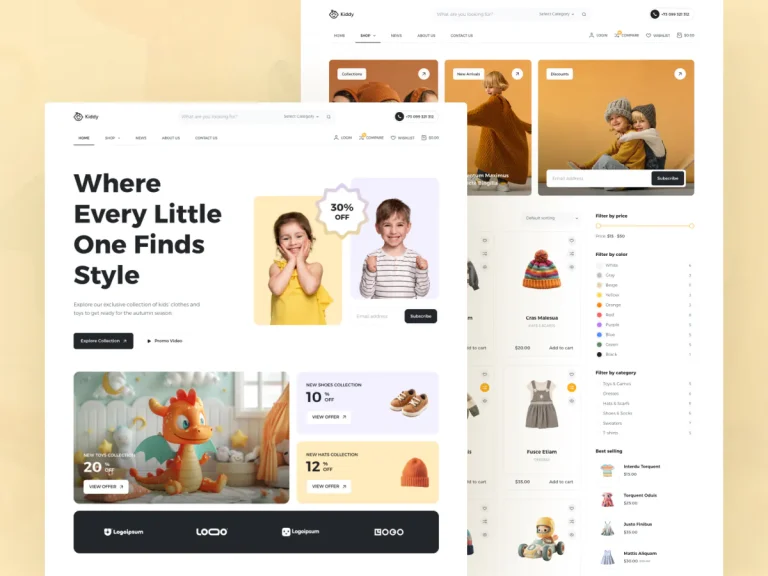
We are long past the point where mobile responsiveness is an “optional feature.” In today’s market, mobile is the primary requirement. If your site is difficult to use on a smartphone, you aren’t just annoying users; you are becoming invisible to search engines.
For several years now, Google has used “Mobile-First Indexing.” This means Google predominantly uses the mobile version of your content for indexing and ranking. Even if your desktop site looks beautiful on a 27-inch monitor, if the mobile version is clunky, slow, or missing content, Google considers your entire site to be low quality.
If you are noticing a steady decline in organic traffic, this is often the culprit. Google is actively punishing sites that do not prioritise the mobile experience.
Beyond Google, there is the human element. Mobile users navigate differently than desktop users. They use their thumbs, they have less patience, and they are often on the go.
Does your current website pass the “Thumb Zone” test?
If a user has to struggle to interact with your site on their phone, they won’t struggle for long. They will leave.
Pull up your website on your phone right now. Try to perform the most important action a customer should take (e.g., buying a product or filling out a contact form). If the experience feels frustrating, slow, or looks like a shrunken version of your desktop site rather than a custom mobile experience, it is definitely time for a website redesign.
Your website might be getting traffic. You might be paying for Google Ads, posting on social media, or investing in SEO to get people to your URL. But what are those visitors doing once they arrive?
If you are paying to bring people to your store, but they are walking in the front door, taking one look around, and walking immediately out, you have a problem. In web analytics terms, this is known as a “High Bounce Rate.”
Two key metrics tell the story of a website that is losing money:
If you have high traffic but low conversions, your website has become a “leaky bucket.” You are pouring water (traffic) in at the top, but holes in the user experience are letting potential revenue drain out the bottom.
Old websites often suffer from cluttered navigation and unclear “User Journeys.” When a potential client lands on your homepage, is it immediately obvious what they should do next?
If a user has to click five times to find your service offerings, you will lose them. A redesign allows you to map out a streamlined User Journey, guiding the visitor by the hand from “Curious” to “Customer.”
Check your analytics. If you see thousands of visitors but only a handful of leads, your design is failing to engage your audience. You don’t need more marketing; you need a better vessel for that traffic. It is time for a website redesign focused on Conversion Rate Optimisation (CRO).
Businesses are organic; they grow, change, and pivot. The company you are today is likely very different from the company you were five years ago.
You may have:
If your website reflects the “old you,” it is creating a massive disconnect for prospective clients. This is often called “Brand Dissonance.”
Imagine a consultant who charges premium rates for high-level corporate strategy. They meet a prospect at a networking event and make a fantastic impression. The prospect is ready to sign a $50,000 contract.
Then, the prospect goes home and visits the consultant’s website. The site looks like a DIY project from 2016. It uses generic stock photos of people shaking hands, the logo is pixelated, and the copy focuses on services the consultant no longer offers.
Instantly, trust evaporates. The prospect thinks, “Wait, are they really as successful as they claim? This website looks cheap.”
Your digital presence acts as a validation tool. If you are claiming to be a market leader, your website must look like a market leader. If your website looks “budget,” clients will expect “budget” pricing, regardless of the quality of your actual work.
Look at your website as if you were a stranger. Does it accurately portray the quality, sise, and sophistication of your business today? If you find yourself apologising for your website, or saying, “Check out our site, but ignore the design, we’re working on it,” then you are actively damaging your brand. It is time for a website redesign to align your digital face with your business reality.
We are taught not to judge a book by its cover, but human beings instinctively judge businesses by their websites. In fact, studies from Stanford University regarding “Web Credibility” have shown that 75% of users admit to making judgments about a company’s credibility based on their website’s design.
Even more alarming? It takes about 0.05 seconds for users to form an opinion about your website that determines whether they’ll stay or leave.
Aesthetics matter. A site that looks like it was built a decade ago signals to users that the company might be out of touch, lacking resources, or perhaps even out of business.
Modern design isn’t just about looking “cool” or trendy; it is about “Cognitive Fluency.” This is the science of how easy it is for the brain to process information.
Does your site suffer from these dated elements?
Compare your site to the top three leaders in your industry. Does your site look like a peer, or does it look like a relic? If your competitors’ sites look fresh, inviting, and high-tech, and yours looks like a digital antique, you are losing the battle for credibility before you even speak to the customer.
So far, we have discussed the “front end”—what the customer sees. But often, the biggest sign that it is time for a website redesign is hidden in the “back end”—the tools you use to manage the site.
How easy is it for your team to update a blog post, change an image, or add a new team member to your “About” page?
If you answered yes to any of these, your website has accumulated “Technical Debt.”
Older websites often suffer from “code bloat.” Over years of adding patches, plugins, and quick fixes, the underlying code becomes messy. This results in:
In 2024, marketing needs to be agile. If you want to launch a new landing page for a promotion next week, your website should empower you to do that quickly. If your website is a logistical bottleneck that requires weeks of development time for simple changes, it is hindering your marketing efforts.
Your website should be an asset you own and control, not a mysterious black box you are afraid to touch. A modern build (using platforms like WordPress, Webflow, or Shopify) puts the power back in your hands. If your current site is a technical headache, a redesign is the only cure.
Perhaps your site used to rank on Page 1 of Google for your main keywords, but over the last year, you’ve slipped to Page 2 or 3.
This is rarely a coincidence. Search Engine Optimisation (SEO) is not a static game. Google updates its algorithm thousands of times a year. They are constantly looking for signals of quality:
Older sites simply weren’t built with these modern technical requirements in mind. You can try to “patch” an old site to improve SEO, but it’s like putting a Ferrari engine in a go-kart; the frame just can’t handle it.
A redesign allows you to build a site with a “SEO-First” architecture, ensuring the code is clean, the schema is correct, and the site is optimised for speed from day one.
If you’ve read this far and realised that it is indeed time for a website redesign, you might be feeling overwhelmed. The good news is that a redesign doesn’t have to be a painful process if you partner with the right agency.
A professional redesign isn’t just about picking new colors and fonts. It follows a strategic process:
A website redesign is an investment of time, energy, and budget. However, it is vital to shift your perspective from viewing it as a “cost” to viewing it as a “growth engine.”
Every day you stick with an underperforming website, you are paying an “opportunity tax.” You are paying it in the form of high bounce rates, lost organic traffic, and customers who chose a competitor simply because their digital experience was superior.
Your website is the foundation of your entire marketing strategy. If the foundation is cracked, everything you build on top of it—social media, email marketing, paid ads—will be unstable.
If you recognised your business in any of the signs above, it’s time to stop the bleeding. It’s time to build a website that works as hard as you do.